
Homepage Readability: What to Measure and What to Fix
Homepage readability is more than a score. Learn which reading level to aim for, what scores miss, and how to fix a service homepage that loses buyers.

Written by Thiam Hock NgFounder
15 min read
Homepage readability is how quickly a prospect can understand what you do, who it is for and what to do next, without effort. A reading-grade score is one input. Layout, word choice and the order of your message matter just as much. For a service business selling work above $2k, the practical target is plain, specific copy at roughly Grade 8 to 10, tested with real people.
I see the same pattern on service sites in Singapore and elsewhere. The copy is grammatically fine, the design is polished, and the enquiries are still thin or price-led. Often the problem is not that the page is hard to read. It is that the page is hard to decide from.
TL;DR
- Aim for about Grade 7 to 9 for general web copy and Grade 8 to 10 for professional B2B services, per this reading-level guide.
- Scores only count word and sentence length. They miss layout, contrast, white space and meaning, so pair them with a human test.
- Readable does not mean simple. Cut jargon and clever phrasing, not precision or premium positioning.
- Fix the order first: what you do, who for, proof, next step. Then edit the sentences.
- Test by watching a real prospect use the page for 15 seconds, not by chasing a perfect number.
Table of Contents
- What homepage readability actually means
- Which reading level should a service homepage aim for?
- What readability scores miss
- Readable is not the same as simple
- The company-centric trap
- A practical way to audit your homepage
- Before and after: three common rewrites
- Our perspective
- Where a blueprint helps
- Common mistakes to avoid
- FAQ
- Sources
What homepage readability actually means
Most owners treat readability as a grammar exercise. Shorter sentences, fewer long words, done. That is a fraction of it.
I prefer to think of it as cognitive load. Every time a visitor has to decode a phrase, guess what a heading refers to, or hunt for the point, they spend effort that should go toward judging your value. When effort runs high, they leave, and often for a competitor whose answer is clearer.
The usability research backs this up. Nielsen Norman Group’s homepage usability guidelines are built on years of user testing, and the recurring finding is that visitors want a fast answer to one question: do you handle situations like mine? If the page cannot answer that in about 15 seconds, the visitor moves on.
So a readable homepage has four properties:
- Plain words. The language your buyers use, not your industry’s.
- Clear order. The most important message first, supporting proof next.
- Easy to scan. Headings that carry meaning, short paragraphs, enough space.
- Legible presentation. Contrast, font size and line length that do not tire the eye.
Only the first is something a score can approximate.
Which reading level should a service homepage aim for?
A reading grade level is a US school-grade estimate of the education needed to understand a text on first read. A Grade 8 text suits someone who has completed about eight years of schooling. It is not an insult to your audience. It is a measure of effort.
For guidance, one reading-level calculator suggests Grade 7 to 9 for general web content and Grade 8 to 10 for B2B and professional writing. It also notes that Grade 13 and above reads as academic or specialist prose, which tends to shut out general readers.
Here is how I would apply that to a homepage:
| Page element | Sensible target | Why |
|---|---|---|
| Headline and subheadline | Grade 6 to 8 | First impression; must land in seconds |
| Service descriptions | Grade 8 to 10 | Buyers expect some professional vocabulary |
| Proof and case summaries | Grade 8 to 10 | Specifics matter more than simplicity |
| Buttons and form labels | Grade 5 to 7 | Action text should never need thought |
These are my working ranges, built around the sourced Grade 7 to 10 band. Treat them as a starting point, not a rule.
Why Singapore readers are a useful reference
Singapore buyers are often reading in their second or third language, skimming between meetings, and comparing several providers. That is a strong reason for plain wording even when your offer is sophisticated.
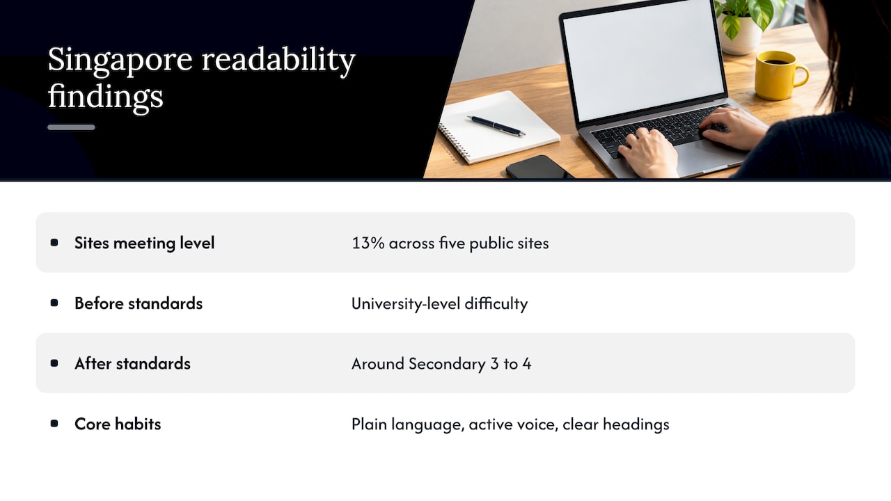
The Singapore Government Design System sets out its content writing principles: clear, direct, respectful and purposeful. It asks for plain language, active voice and sentence case in headings. It also reports that applying these standards to agency content moved it from university-level difficulty to around Secondary 3 to 4 while keeping the original intent.
The scale of the gap is striking. A government hackathon project, SpeakEasy, reports that only 13% of content across five key public-facing government sites met lower secondary reading levels. If public agencies struggle with this, private firms writing about “end-to-end solutions” and “synergistic frameworks” certainly do.
You do not need to follow every government rule. Avoiding contractions, for instance, is a style choice for public services, not a requirement for a consulting homepage. But the core habits transfer well: say exactly what you mean, use the active voice, and write headings that tell people what the section is about.
What readability scores miss
Flesch-Kincaid and similar formulas are quick and cheap. As A List Apart explains, they measure quantifiable elements such as word length and sentence length to predict the skill level needed. That is useful for flagging a paragraph that has run away from you.
But the same measure has limits that matter on a homepage:
- They ignore meaning. A sentence of short, common words can still say nothing.
- They ignore order. A perfectly scored page can bury your main offer under a mission statement.
- They ignore layout. Color contrast, font legibility and white space all affect reading, and no formula sees them.
- They reward the wrong edits. Chasing the number can strip out the precision that signals expertise.
This is not a new complaint. A classic paper on readability formulas in technical communication argued that the formulas can be counterproductive because they pull a writer’s attention toward words and sentences and away from what actually helps the reader. Even the research on accuracy of readability formulas in health content shows that different formulas can disagree, which is a good reason not to treat one score as a verdict.
A quick example
Take this headline: “Leveraging holistic, scalable solutions to optimize stakeholder outcomes.” Run it through any checker and you will get a poor score. Fine.
Now take this one: “We help firms win better clients.” It scores beautifully. But it is vague. Which firms? Which clients? How?
The version that works is more specific and still readable: “We rebuild accounting-firm homepages so owners get fewer price shoppers and more serious enquiries.” The score will be only a little worse than the vague one. The usefulness is far higher. That trade is exactly the one a formula cannot see.
Readable is not the same as simple
Here is the objection I hear most from premium service owners: “If I write plainly, I will sound cheap.”
I understand it. But the opposite is usually true. When prospects have to decode your language, they are not thinking about your value. They are thinking about how much work you are making them do.
Premium positioning comes from specificity, not from vocabulary. Compare:
- “A bespoke, end-to-end advisory experience” (could describe anyone)
- “One senior partner on every engagement, from first call to final report” (only some firms can say this)
The second is easier to read and sounds more expensive, because it makes a promise a buyer can picture and a cheaper competitor cannot easily copy.
The research on B2B sites adds a nuance. Complex, high-cost services need more sophisticated usability, not less. Buyers involve several stakeholders, so the page has to serve a quick-scanning early researcher and a deeper reader who wants detail. ZenBacon’s B2B usability guidance stresses clearly communicating what the company does on the homepage and in corporate areas, a guideline it says is often violated.
In practice, that means layers. Give the skimmer a clear headline and three-line summary. Give the careful evaluator a path to deeper material. If you are thinking about how this layered approach relates to qualifying who is ready to buy, B2B lead qualification frameworks show how different buyer stages call for different levels of information.
The company-centric trap
The most common readability failure I see is not long words. It is a page organized around the business instead of the buyer.
Typical symptoms:
- Navigation and sections mirror internal departments or divisions.
- The hero statement describes the firm’s history or values.
- Services are listed by internal names that a stranger would not search for.
- The first mention of the audience comes halfway down the page.
Nielsen Norman Group’s guidelines flag this kind of structure as a common reason for low conversion. The visitor does not care how you are organized. They want to know if you solve their kind of problem.
A useful fix is to rewrite your section headings as the questions your best clients asked on their first call. If you do not know them, listen to recorded calls or read the enquiry emails you already have. That is voice-of-customer language, and it is the fastest route to plain words that also happen to be your buyers’ words.
A practical way to audit your homepage
You can do a first pass in an afternoon.
Step 1: Run the copy through a checker
Paste your homepage text into a free grade-level tool. Do it section by section, not as one lump, because an average hides the problem paragraphs. Note anything above Grade 12. Treat the result as a flag, not a grade for the page.
Step 2: Do the five-second test
Show the page to someone outside your industry for five seconds, then hide it. Ask three questions:
- What does this company do?
- Who is it for?
- What would you do next?
If they cannot answer, no score will rescue the page. This is the human testing that A List Apart and other practitioners recommend alongside formulas.
Step 3: Hunt for decoding work
Highlight every phrase a prospect would have to translate. Typical culprits are internal service names, abstract nouns (“enablement”, “optimization”), stacked adjectives and acronyms never explained. Replace each with what you actually do and for whom.
Step 4: Check the order
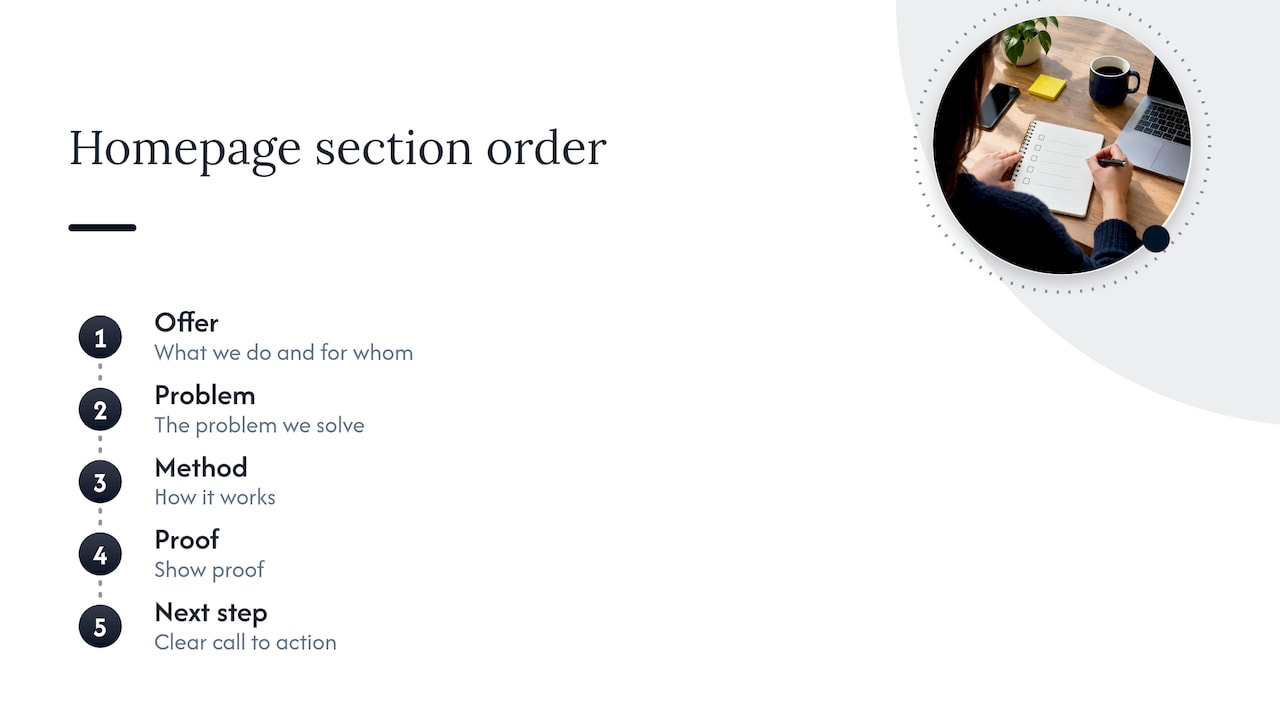
List your sections in sequence. A strong service homepage usually moves through: what we do and for whom, the problem we solve, how it works, proof, then a clear next step. If proof or a call to action is buried, move it up. Our messaging hierarchy guide walks through a seven-step version of this order.
Step 5: Check the physical reading experience
Look at contrast, font size, line length and spacing, and test on a phone. Plain words in a pale grey, 12-pixel font are still hard to read. We cover this in more depth in our piece on visual hierarchy and contrast, and our notes on mobile homepage design cover the small-screen side.
Step 6: Fix the buttons
Buttons and form labels are the most-read words on the page. “Submit” tells a visitor nothing. A label that names the outcome lowers hesitation. See our examples of homepage microcopy for service buttons.
Before and after: three common rewrites
| Before | After | What changed |
|---|---|---|
| ”Innovative solutions for modern enterprises" | "Tax and compliance support for Singapore SMEs with 10 to 100 staff” | Names the audience and the service |
| ”Our approach is holistic and client-centric" | "We start with a 45-minute call, then send a written plan within a week” | Replaces a claim with a process (an illustrative example) |
| “Get in touch" | "Book a 20-minute fit conversation” | Sets expectation of the next step |
The examples are illustrative, not client results. The pattern is what to notice: each “after” is more concrete, and none of them is dumbed down.
Our perspective
We built Hockworks around one belief: a website is a decision system, not a brochure. It should work like an extension of your best salesperson, answering the questions a serious prospect has, in the order they ask them.
That is why we do not start with a reading score. We start by finding decision friction: the places where a visitor hesitates, doubts or quietly decides you are not for them. Often the friction is a vague headline, a missing proof point or a call to action that asks for too much too soon. Sometimes it is simply wording that makes the reader work.
For firms that sell services above $2k and already get traffic, this matters more than any redesign. A redesign changes how the page looks. A clearer message changes who enquires. We capture the language your clients use, clarify your positioning, and lay out messaging, proof placement and calls to action in a blueprint, with a video walkthrough so your team can implement it with confidence.
Our advice on scores is blunt. Use them to catch the worst offenders, then stop. Put your effort into clarity of message and watching real people use your page. If you can make a stranger understand your premium value in seconds, the grade level has taken care of itself.
— Fadly
Where a blueprint helps
If your homepage reads fine but still draws price-shoppers, the issue is probably structure and positioning, not vocabulary. Our Homepage Restructure for service businesses addresses that without a risky redesign.
The published fixed fees on our pricing page are SGD 480 one-off for a Homepage blueprint, SGD 680 one-off for Homepage + About, and SGD 2000 one-off for a Full site. If you would rather see what we would flag first, start with a free website review.
Common mistakes to avoid
- Writing for the score. You end up with choppy, vague copy that fails premium buyers.
- Simplifying away the proof. Specific numbers, scope and outcomes are what make plain language credible.
- Ignoring the stakeholder. In B2B, the person who reads your page is often not the person who signs off. Give both something to hold on to.
- Testing only on insiders. Your team already knows what “our methodology” means. Your prospects do not.
- Fixing words but not order. Perfect sentences in the wrong sequence still lose the visitor.
If your page looks good but still underperforms, our post on why a good-looking service homepage does not convert goes through the usual causes.
FAQ
What is a good readability score for a website?
For general web content, Grade 7 to 9 on the US school-grade scale is a common target. For professional B2B services, Grade 8 to 10 is a reasonable range. Use it as a guide, not a pass mark, because the number cannot judge meaning or layout.
Do I need to check my website’s reading level?
It is worth doing once, section by section, because it quickly shows the paragraphs written in dense, specialist prose. It takes minutes with a free calculator. But follow it with a test on a real person, since a formula cannot tell whether your message makes sense.
What does plain language mean on a business website?
It means saying exactly what you mean in words your audience already uses, with active voice and clear headings. The Singapore Government Design System frames this as being clear, direct, respectful and purposeful. It does not mean removing detail or expertise.
Will simpler writing make my firm look less premium?
Usually not. Premium positioning comes from specific promises and credible proof, which are easier to read than abstract claims. Vague, inflated language tends to sound generic, and generic sounds cheap.
How do I know if readability is why my homepage is not converting?
Show it to a few people outside your industry for five seconds and ask what you do, who it is for and what to do next. If they cannot answer, the problem is clarity or order. Our free website review can help identify where visitors hesitate.
Sources
- 113 Design Guidelines for Homepage Usability, Nielsen Norman Group
- B2B Website Usability, ZenBacon
- SpeakEasy, Hack for Public Good
- The Place of Readability Formulas in Technical Communication
- Testing Content, A List Apart
- Content, Singapore Government Design System
- Reading Grade Level Calculator
- The Accuracy of Readability Formulas in Health Content: A Systematic Review